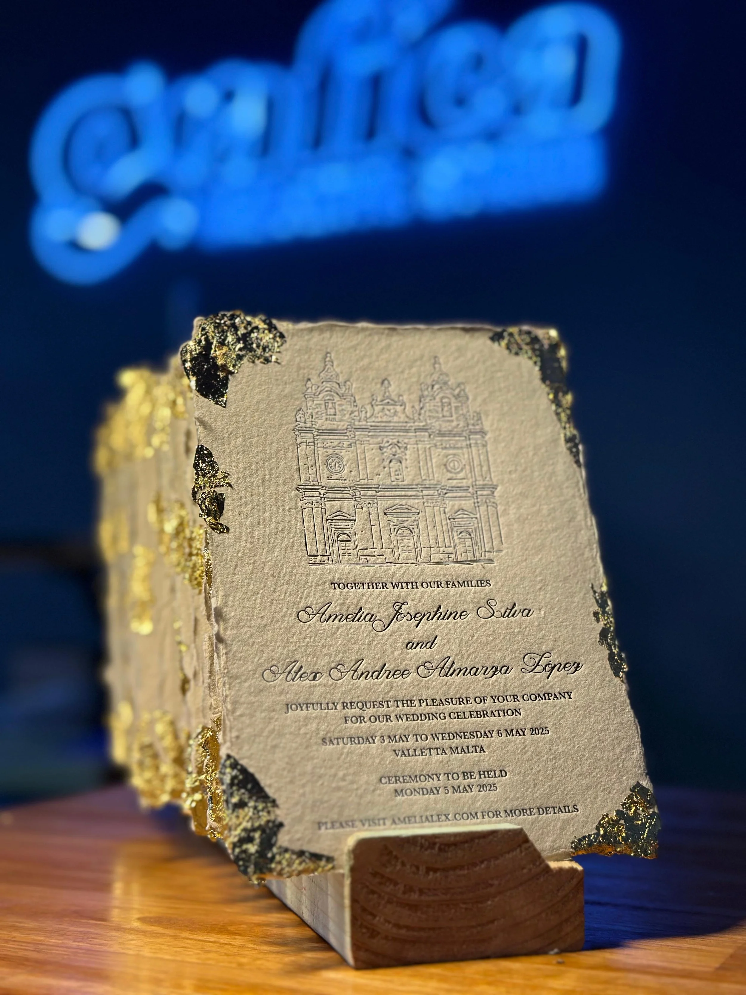
Letterpress 101: How to Prepare Your Artwork for Print
So, you’ve decided to go with letterpress printing for your wedding invitations, business cards, or stationery. Great choice! Letterpress is all about texture, depth, and that tactile finish you just don’t get with regular printing. But before we fire up the press and start creating, it’s important to make sure your artwork is set up correctly.
This guide will walk you through the essentials: file setup, bleed, and paper selection. Think of it as your go-to checklist to get the best results from your design.
File Types That Work Best for Letterpress
To make the printing process smooth, your artwork should always be set up in a print-ready format. The recommended file types are:
Adobe Illustrator (AI)
SVG or EPS (with fonts outlined so nothing shifts)
PDF saved from Illustrator (with outlined text)
Vector files are the best choice since they can be scaled without losing sharpness. If your design includes text, make sure all fonts are outlined or expanded before sending. This avoids unexpected changes during production.
👉 One more thing to keep in mind: avoid super thin lines or tiny fonts. For letterpress, all lines and type should be at least 0.25 pt thick. Anything finer may not print well or could lose detail during pressing.
Why Bleed is Important in Printing
Bleed ensures your finished design looks sharp after trimming. It simply means extending your artwork slightly beyond the final cut line so there are no white edges.
For letterpress projects, we recommend adding a 3mm bleed around your design. This is especially important for backgrounds, borders, or artwork that runs to the edge of the paper.
Choosing the Right Paper for Letterpress
The paper you choose can completely transform your final piece. Letterpress thrives on heavier, textured papers that hold the impression beautifully.
Things to consider:
Thickness: Aim for at least 350gsm or if you can ideally start from 450gsm or thicker for that deep, tactile impression.
Texture: Cotton papers are soft and luxurious, while textured stocks add a rustic touch.
Color: Classic white or off-white is timeless, but soft shades like blush or sage can make your design stand out. Darker stocks combined with white or metallic foil create bold, modern looks.
If you’re unsure, we’re always happy to recommend the best stock based on your design and budget.
Checklist Before Sending Your Files
Save as AI, EPS, SVG, PDF.
Outline or expand all fonts.
Add a 3mm bleed if your design runs to the edges and 5mm internal safe margin.
Double-check spelling and alignment.
Choose a paper that works with the impression you want.
Final Thoughts
Preparing your artwork for letterpress doesn’t need to feel complicated. With the right file format, bleed setup, and paper choice, your project is already halfway to looking amazing.
Letterpress is all about craftsmanship and detail. Those small tactile variations are what make each piece unique and unforgettable.
If you’re ready to print your wedding invitations, business cards, or custom stationery, we’d love to help bring your vision to life. Get in touch with us at Grafica Creative Studio in Brisbane and let’s create something beautiful together.


